My Ta
“Visual Meanings and Variations in Illustrations of Alice in Wonderland”
Since the 19th century, “Alice in Wonderland” has been embedded in many children’s memories. “Alice in Wonderland” is a book first published in 1865, written by an English author under the pseudonym, Lewis Carroll. The book focuses on a young girl named Alice, who possesses a strange mind and is described as “Curiouser, curiouser”. The story illustrates her adventures in Wonderland, where Alice becomes the hero despite her young age. The plot “represents a once-for-all opportunity for Victorian adulthood to renew itself, an opportunity which it cannot, dare not, grasp” (Graham, 1973).
The story is part fairy tale, as it involves the familiar plot of “good versus evil”. Nevertheless, there is always room for creativity and customization, as it also includes sarcastic images of villains, peculiar and unique illustrations of animals and creatures, and the world of impossibilities. For that reason, there are thousands of book illustrations of “Alice in Wonderland” by different illustrators with different aesthetic styles.
Fifty years since the first introduction of the book, the Victorian era gradually shifted to the new era called the Edwardian era. Inspired by the previous times, the Edwardian era managed to capture the essence of the Victorian but added a few modifications. Fewer corsets and more loose dresses would be one example. In this study, our aim is to focus on the differences between several illustrations in terms of visual aesthetic, landscape, formatting, and color palette in the Victorian and Edwardian era. Our goal is to compare some illustrations from the Edwardian time and connect the aesthetic differences with the conceptual and temporary aspects of the current time that affect the artwork of “Alice in Wonderland”.
Along with the two initial editions of “Alice in Wonderland” by Carroll and Tenniel, the paper will select Rackham’s (1907) and Newell’s (1901) illustrations in different versions of the book. With a similar yet distinct aesthetic style, these two artists will integrate aspects of artistic preference prevalent during the first decade of the 20th Century.
Carroll, Tenniel, and the Victorian Era
Lewis Carroll wrote the story in 1862 during a boat trip along the Thames River. Carroll, a mathematician at Christ Church in Oxford, first told the creative story to the daughters of the dean of his college, Henry Liddell. After the trip, one of Liddell’s daughters, Alice, insisted Carroll on writing the story down in a small sketchbook, which led to the development of the first edition of “Alice in Wonderland” (Jaques & Giddens, 2013). The manuscript, sketched down by Carroll, contained the initial illustrations of “Alice in Wonderland”; however, it did not include the entire storyline, which resulted in a shortage of several characters, scenes, and illustrations.
Since the original manuscript was merely a short version of “Alice in Wonderland,” Carroll did not intend to publish the book with his illustrations. He was anxious about his artworks and how they would appear with the written text, so he came to a famous illustrator named John Tenniel for assistance. Since Tenniel’s illustration was supposed to be the updated and improved version of Carroll’s, there will be several similarities between the two versions, along with some updated components related to aesthetic techniques and characters’ development.
In the original manuscript, Lewis Carroll created some illustrations, despite the incomplete content. The author used ink pens that gave fine lining to draw the images, creating thin and sheer strokes and giving the artworks a soft and delicate appearance. Moreover, Carroll used the lines to depict the texture of the elements. For instance, he drew small half–curves to mimic the grass, long wavy curves to describe Alice’s hair, and short interwoven lines to replicate the feathers of the birds.
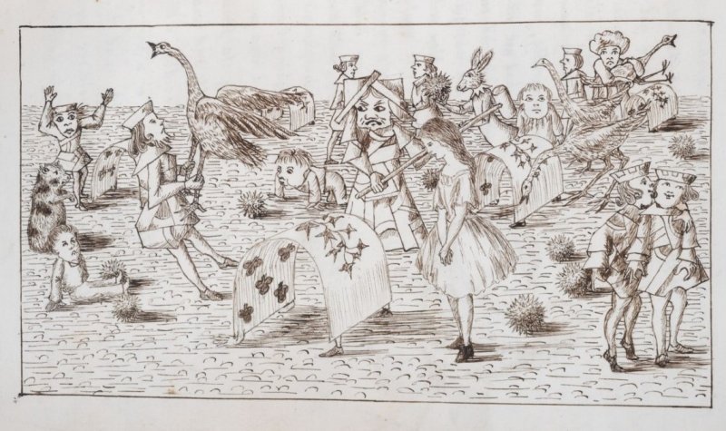
On the other hand, Tenniel’s illustrations are a lot sharper and more intense. The artist also used ink pens for the art-making process but certainly a different type or style. Specifically, he creates hard and coarse strokes, which contradicts Carroll’s delicate and fine lines. Similar to the author of the book, Tenniel made use of several lines for shading. With the tendency to use hard and strong strokes, Tenniel also applied the same technique to his shading, which consists of thick and sharp lines interspersed together. Contrary to Carroll’s soft lining to depict the elements’ textures, Tenniel’s main purpose for using hard lines was intensive shading; he aimed to add more depth to the artworks.

In Tenniel’s illustration, the artist seemed to prefer his characters with rather small figures. Likewise, Alice and the Red Queen look miniature based on their heights. Although there is a taller lady pictured behind them, that lady remains rather short and small–figured compared to the background of the artwork. The dominant height figures in England around the 1860s may have influenced Tenniel’s perspective toward the depiction of characters in his artworks. According to Parkinson (2013), the average height of men around the time was five feet five inches, while the average height of men in the current time is five feet nine inches (NHS Digital, 2017, p. 12).
Both the manuscript and first published edition of “Alice in Wonderland” took place in the 1860s, which belonged to the Victorian era (1837-1901). Carroll’s story indeed fits perfectly with its divine characters and figures as the era “is marked by a peculiar intertwining of word and image” that creates a signature aspect for illustrated novels and art writing (Gunning, 2012). The era is famous for its tight and strict discipline in many ways. Corsets, for example, are one of the most notable aspects of the Victorian era, representing the “propriety, constraint, and femininity” of a Victorian woman (Montz, 2019). This is only one example of the rigorous and high-maintenance life in the Victorian era, and, perhaps, that is why the preference for arts and writing during that time leans toward freedom and imagination. “Alice in Wonderland” is a perfect example of that, and the contradictions between the formal life in reality with Carroll’s imaginary world partly show some insights within that society.
Rackham, Newell and the Edwardian era
Fifty years after the initial illustrations by Carroll and Tenniel, several artists attempted to create their version of “Alice in Wonderland”. In this section, our focus will include the two illustrations of Rackham (1907) and Newell (1901). Both artists had their careers during the Edwardian era, and while Rackham was an English illustrator, Newell marked his career in the United States.
Arthur Rackham was born and raised in England. He took part as a leading figure during the Golden Age of British Book Illustration. The artist has a distinct aesthetic style; his artworks are usually created by robust pen and ink, combined with the use of watercolors. Rather than elaborating on highlights, Rackham usually laid his eye on the sketching of lines, which is usually overlooked by the audience (Kamenetsky, 1977). As Selma Lanes (1971, p. 68) has said, he would attempt to “illustrate the unillustrable, or to rescue from oblivion words the reader had most likely never noticed”.
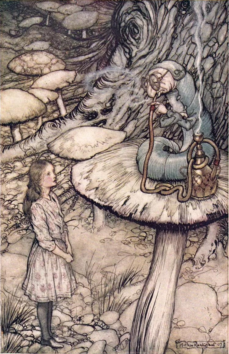
Another key characteristic of Rackham’s artworks is his preference for warm colors that bring a nostalgic look. His choice of colors includes different shades of mixed grey, rich brown, warm ivory, and deep pine green. The artist tends to blend soft pastel colors into meticulous details to give an antique and vintage tone. His illustrations, as a result, has the background of ancient parchment (Kamenetsky, 1977).
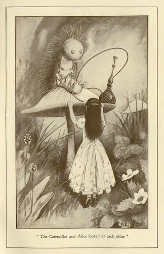
Unlike Rackham, Newell works primarily with monotone- several shades of black and white. In Newell’s illustrations, the artist omits heavy lines and emphasizes on shading and tone instead. During his time, there was an innovation in the publishing industry: magazines and books were created by the new process of photomechanical printing, replacing the old method of wood-engraving using outline and cross-hatching (Hearn, 1983). Thanks to the technology breakthrough, artists were able to create tone shading with the same effect as in ink washes. Newell was one of the first illustrators to embrace this new technology breakthrough and utilize it fully, using a broad range of tones in his illustrations (Reinhard, 2010). As Hearn, T. Clark, and H.N.B Clark has commented, his artworks are a collaboration of the new half-tone process with multiple shades of fine gray.
Rackham and Newell’s illustrations of “Alice in Wonderland” were published around the 1990s, which was during the Edwardian era. Followed by the Victorian era, the Edwardian era modified some aspects in terms of arts and lifestyle: it was a start of loose dresses and a golden decade for the cosmopolitan lifestyle (Stephenson, 2013). During this time, people tended to value modernity, innovation, and diversity, which was evident through Newell’s distinct aesthetic style and Rackham’s preference for warm colors. Both illustrators had different approaches to the book, and they also managed to integrate some Edwardian aspects into the artworks.